
Overview
How do you measure the quality of an experience on a spatial-computing headset? Traditional UX questionnaires capture satisfaction and usability well, but they were never designed to capture what makes an immersive experience feel truly convincing.
This project set out to build a standardized, quantitative assessment of user experience for head-worn platforms (Apple Vision Pro / visionOS). The goal was to give teams a common vocabulary and a set of comparable scores for discussing the quality and tradeoffs of an experience, so product decisions could rest on a validated instrument rather than ad-hoc surveys or intuition.
Grounding in presence research
The work is built on several decades of academic literature on presence — the psychological sense of “being there” inside a mediated experience.
Classical presence research describes three ingredients working together:
- Media engagement — the content draws you in.
- Attention — distractors fade away.
- Mediating technology — something stands between you and the experience.
A more contemporary framing treats presence as a form of attentional comfort: to what extent do we notice the role of technology while we’re inside an experience? The less the mediation intrudes, the stronger the presence. This lens shaped how the whole instrument was designed.
The problem
- Generic UX questionnaires aren’t specific enough to isolate the presence signal, which is precisely why a rich body of presence-measurement literature exists in the first place.
- Much of that seminal literature is decades old, developed and validated on early, primitive immersive systems rather than modern spatial computing.
- The response: review the relevant literature, re-contextualize it for modern spatial computing, and experimentally validate a new measurement instrument fit for today’s platforms.
Building the instrument
The questionnaire was derived, not guessed. The development pipeline moved from a wide net to a focused, validated tool:
- Literature review — surveyed a broad range of established presence questionnaires and the theory behind them.
- Question harvesting — collected a large pool of candidate questions spanning many experiential dimensions.
- Expert review — refined the pool for language, clarity, and intent.
- Validation study — deployed the candidate questionnaire against multiple Apple Vision Pro app experiences, deliberately chosen to span the active ↔ passive and augmented ↔ virtual axes so the instrument would generalize across very different experiences.
- Exploratory Factor Analysis (EFA) — used the study data to collapse the many candidate dimensions into a smaller set of strongly-correlated constructs.
- Refinement — pruned questions with weak signal or that confused respondents, then distilled the validated set down to a compact core questionnaire that still retains signal for every construct.
The questionnaire uses a 7-point Likert scale, with items worded both positively (e.g., “The experience was enjoyable”) and negatively (e.g., “It was hard to understand how to interact with the experience”) to guard against response bias.
What the framework measures
Factor analysis surfaced a set of core constructs, each capturing a distinct facet of the experience:
- Interaction Fluency — how effortless it is to understand and control the experience.
- Appeal — how enjoyable and compelling the experience feels.
- Motion Sickness & Visual Discomfort — cybersickness and visual strain.
- Physical Discomfort — ergonomic and bodily comfort during use.
- Spatial Presence — the sense of “being there” in the experience.
- Disruption — how much external reality breaks through.
- Sense of Mediation — how noticeable the technology itself is.
From responses to scores
Raw questionnaire responses are turned into interpretable indicators using well-established methods.
Net Promoter Score foundation
The scoring adapts the widely used Net Promoter Score (NPS) approach, which classifies respondents as promoters, passives, or detractors:
NPS = (% Promoters − % Detractors)NPS runs on a −100 to +100 scale, where a positive score means more promoters than detractors, and common rules of thumb treat higher bands as increasingly favorable. Likert responses are mapped onto this methodology per question, with the mapping inverted for negatively-worded items so that scoring stays consistent, then aggregated per construct.
Weighting the constructs (Bradley-Terry model)
Not every construct contributes equally to the overall experience, so the framework assigns each a weight. Rather than choosing weights by hand, they were derived empirically using the Bradley-Terry pairwise comparison model:
- A panel of experts repeatedly chose the more important of two constructs across all possible pairs (e.g., “which matters more here — Appeal or Physical Discomfort?”).
- Maximum Likelihood Estimation converted those pairwise judgments into a set of normalized importance weights that sum to one.
Because the weights are data-derived, they can be re-estimated as understanding evolves, and the method supports program-specific weighting schemes when a particular effort has different priorities.
Three outputs
From the core questionnaire, the framework produces three complementary views:
- Composite score — a single, top-line summary of overall experience on the familiar −100 to +100 scale.
- Weighted matrix — per-construct scores adjusted by their importance weights, adding context to the composite.
- Unweighted matrix — raw per-construct performance, which is most useful for failure analysis and identifying concrete next steps.
Gaze behavior analysis (my independent research)
Alongside the questionnaire, I led an independent line of research exploring what users’ eyes reveal about an experience, and how that objective signal relates to what they tell us in the survey.
The idea: a subjective questionnaire captures how an experience felt, but gaze and head movement capture how it was actually attended to, moment to moment. Bringing the two together lets us ground self-reported comfort and presence in observable behavior.
Collecting the data
During user-study sessions I logged eye-gaze direction and head pose while participants worked through a deliberately varied set of experiences, spanning the same active ↔ passive spectrum used elsewhere in the project:
- Active experiences that ask the user to look around, reach, and move — for example, a spatial puzzle-solving task and an open, free-form manipulation task.
- Passive experiences where the user largely observes — for example, immersive environmental content and 3D video viewing.
Streams were recorded in the open XDF (Extensible Data Format) via Lab Streaming Layer, a widely used standard for time-synchronized behavioral data.
Turning gaze into heatmaps
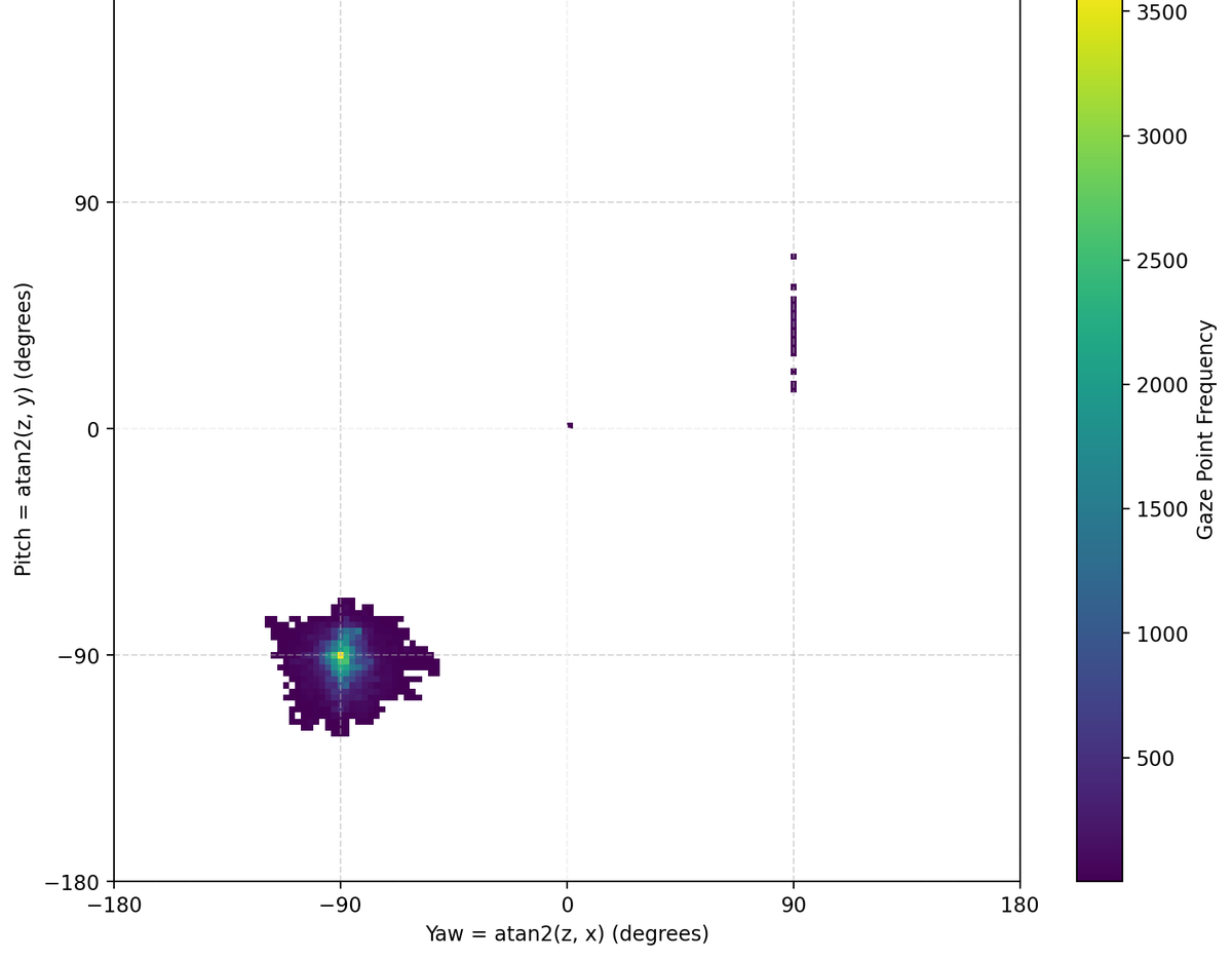
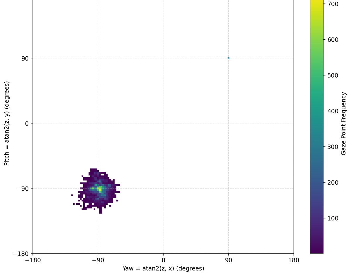
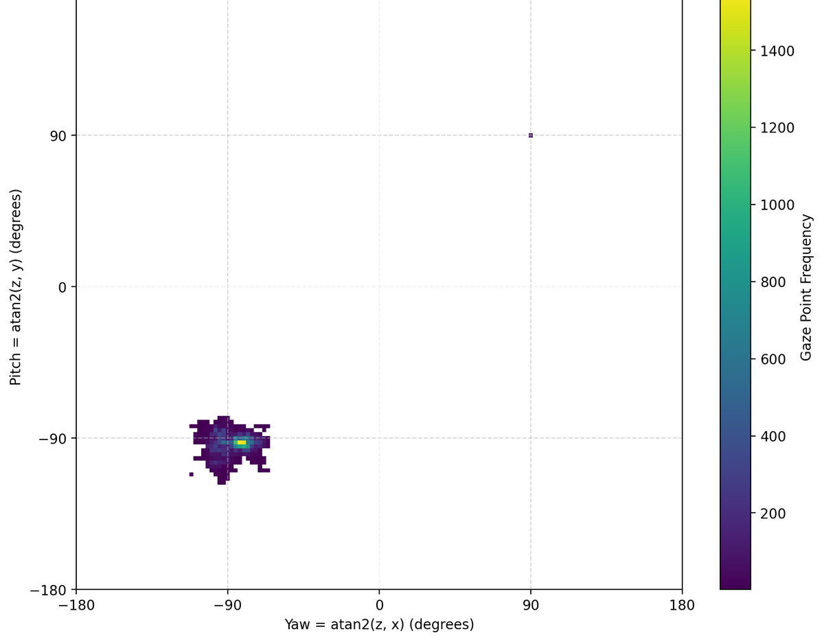
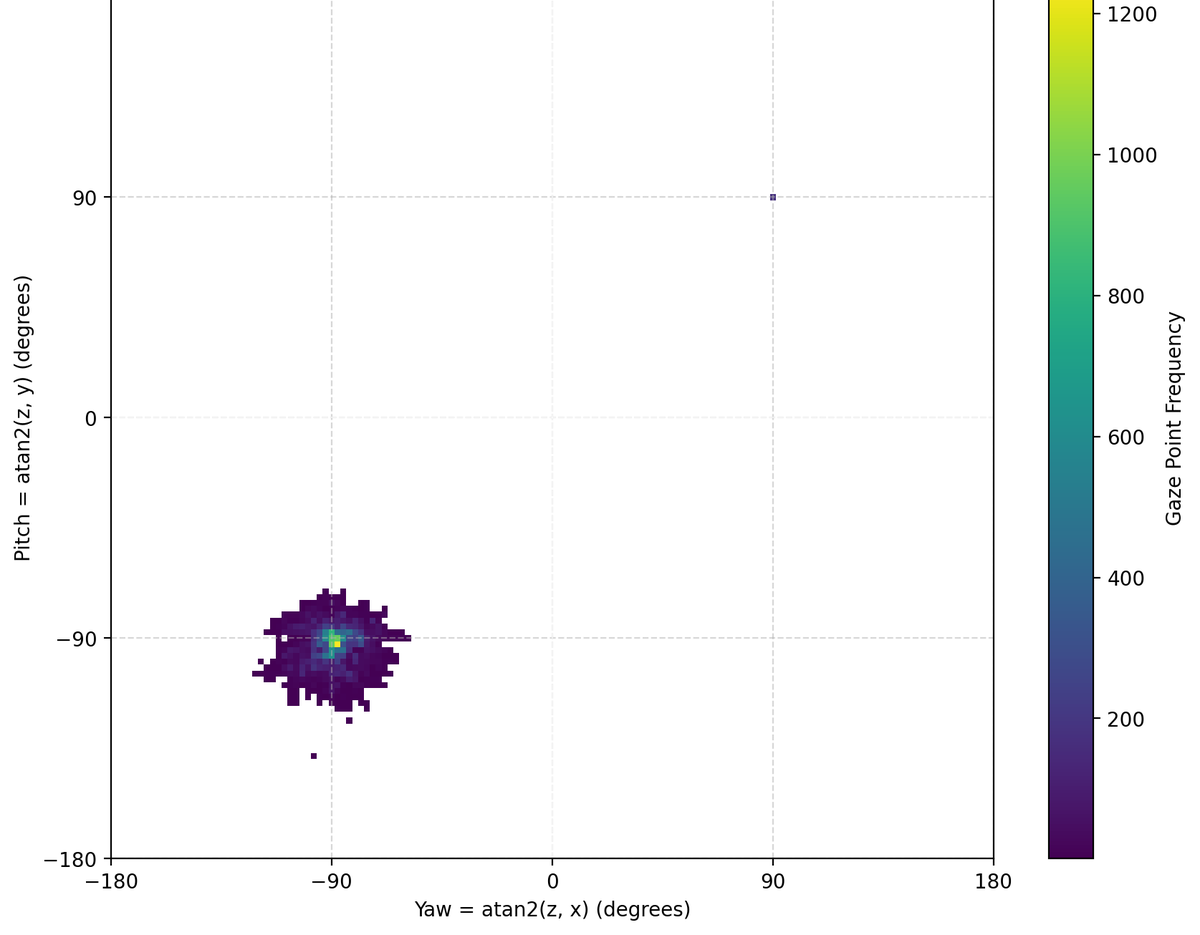
I wrote the analysis pipeline in Python (pyxdf, NumPy, Matplotlib). Raw gaze vectors were converted into yaw and pitch angles and binned into 2D histograms to produce gaze heatmaps — a compact picture of where, and how widely, a person looked during an experience.
The heatmaps made behavioral patterns immediately legible: tightly concentrated “hot spots” for focused tasks versus broad, dispersed gaze for exploratory or free-viewing ones.
What I looked for
- Patterns by experience type. How do eye- and head-movement signatures differ between active experiences (which invite scanning and motion) and passive ones (which tend to settle attention)? The heatmaps surface clear, repeatable differences in gaze spread and stability.
- Correlation with the questionnaire. I compared these behavioral signatures against participants’ subjective responses, looking for relationships between how people looked and how they rated comfort, presence and engagement.
- Form factor and comfort. I ran the analysis across different headset form factors to investigate how the pull of compelling visual content might offset physical discomfort — in other words, whether engagement can help a heavier or less comfortable configuration still feel good to wear.
This strand tied the project’s subjective instrument to an objective behavioral measure, and it’s the part of the work I’m most personally invested in: using real interaction data to understand, and design for, human attention and comfort.
Why it matters
- Replaces ad-hoc UX questionnaires with a standardized, repeatable, quantitative way to compare experiences and design tradeoffs on head-worn platforms.
- Grounds decisions in a validated psychometric instrument — constructs derived through factor analysis, weights derived through expert consensus — rather than intuition.
- Produces both a single comparable number and diagnostic matrices, so teams can benchmark overall experience and pinpoint exactly where an experience falls short.